Back to Basics, Kinda: Hardcoding A One Page Responsive Site
When was the last time you hard coded a website? I can’t even really remember. I think it would have been in 2009 at the very latest, with a small brochureware site. Certainly I remember testing for IE6 and 7.
Since then, I’ve been working on WordPress and Drupal (and even the odd Joomla theme). While it brings its own set of issues, the one thing it does mean is that you usually start with something.
However, I was recently asked to help out a colleague who was waiting for their content managed site to be finished (the developer had got sick and so was a few weeks behind) and so needed a one-page site to tide her over until it was done. When I ever end up doing projects to help out other people, I try to use it as a means of trying something out I’d like to do. In this case, it was trying to make a responsive site (and obviously HTML5 and CSS3). And make it by hand, as the WordPress site could be ready in a matter of weeks if she’s lucky. It was definitely a blast from the past. What did I find?
There’s a framework for that.
I settled on the Initializer framework, as it included a lot of starters, and had a layout similar to what I wanted. (Were I going for more of a landing page look, I’d have used Bootstrap). There were also some beautiful themes available, but they didn’t use Javascript and so didn’t shift. (One could argue that this is a good thing, but I like being able to shift things around!)
You know that ‘bootstrap look’? It’s Helvetica Neue at font-weight: 200.
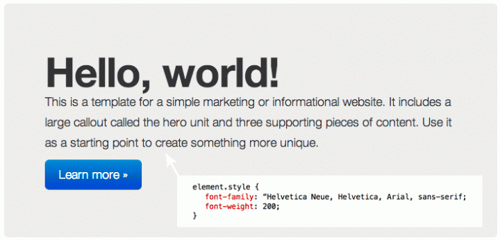
I’d always wondered what exactly it was about the Twitter Bootstrap fontstack that made it look so good. It turned out that they’d been using font-weights, something which I remember messing around with way back in the day but not really coming back to. I personally have memories of Helvetica Neue rendering horribly on my then-work’s computers, but I suspect things have changed since then.
Design around the key breakpoint.
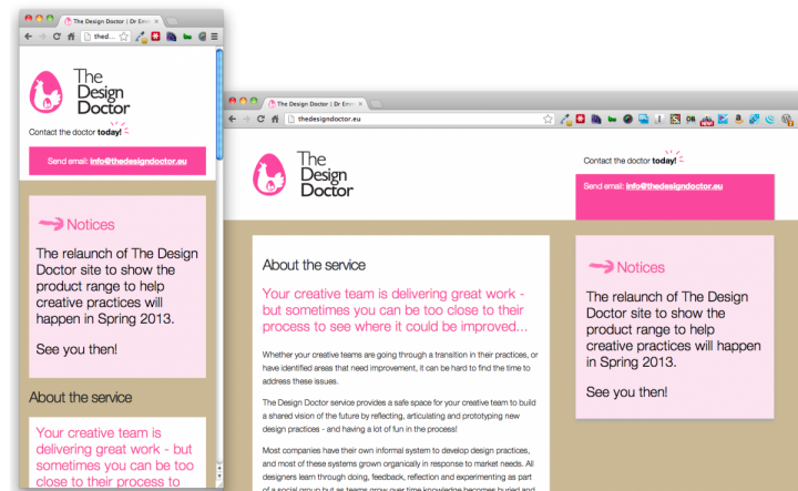
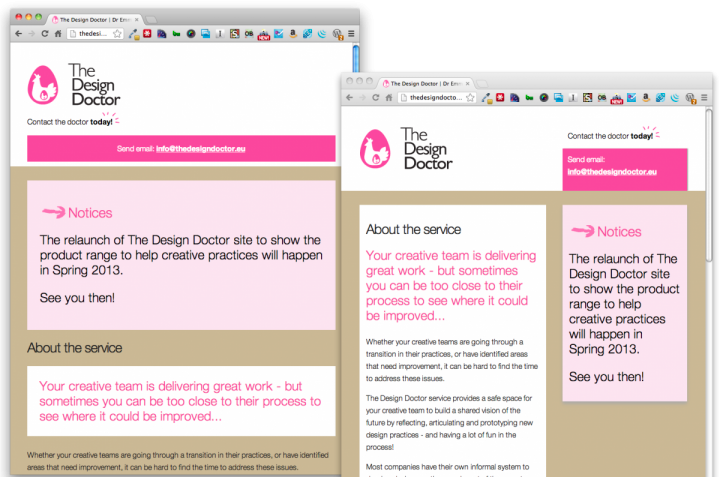
For me, that was 768px, the point where the system snaps between no floats and a two column float. I’d been working from the up to 1180 breakpoint and got myself rather confused in regards to percentages and the like. What’s more, just larger than the breakpoint is where the design will look its worst if you mess up something. Blocks can be problematic at mobile size. The design I was theming was beautiful at a higher screen-width, but as soon as I narrowed it the blocks became excessive. In the end, I opted to take the body text entirely out of the bock and to just sit on the body.
[EDIT: since I’ve written this, I’ve seen Mark Boulton’s thoughtful post about ‘the inbetween’. He suggests to specifically look out for the following things when the viewport changes:
- Type size and leading. Does it need to change?
- White space (macro and micro). Do you need to adjust margins and padding?
- Vertical space. Do you need to reduce it and make the content more or less dense?
- Flow. How is the readers eye movement going to change as you change these elements?
- Words. Are there now too many on one line? Or too few?
- Source order. Are the right things in the right place?
The one joy about using a framework such as Bootstrap is that these things have generally been considered, but it’s still a worthwhile list. I know I changed the source order of some of the blocks after considering where they would fall on a mobile screen.
Boulton also notes that his studio tends to keep all the CSS together in one stylesheet, but are also accounting for more rather than less viewports.]
IE6 is well and truly dead.
I remember having to test things in IE6, but this framework pretty much puts up a message saying “you too old for this place”. (I have to admit that I haven’t tested this design in different browsers as I hope that the shivs should fix them).
You’ll occasionally yearn for easy PHP and plugins/modules
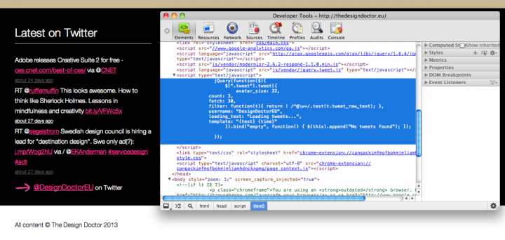
Plugging in services is, as you might expect, a lot more problematic —or less themeable —on a handcoded site. One of the aspects of the design was a twitter feed. This would be a piece of cake on a CMS thanks to plugins or modules (or even just being able to grab PHP code) but on a hard-coded site is more problematic as you either have to create a separate php file to feed in the information, use the (functional but highly branded) official widgets, or use Javacript. I went for the latter as the framework already used jQuery, and it was cleaner. I found a useful and highly customisable JS framework for showing tweets. [EDIT JUNE 2013: as Twitter has changed this API the code no longer works on the site]. There is a point where you realise it’s not worth staying hard-coded. There was the option to put images on the page. I realised that the time of getting a library and sorting out how a slideshow would work probably wasn’t worth it, given that the site would be replaced by a content managed one that would make this a heck of a lot easier.
HTML5-what?
I have to admit that I’m still not entirely clear about all of the new attributes available to me (unlike the CSS stuff, which we tend to be aware of as they’re obviously useful). I have a few things that I’m not sure are semantically correct, like having more than one footer. And I suspect there are things like date attributes that I could use. It reminded me that I need to investigate them, even if CMSes like Drupal are still struggling to get them into their core code outputs.
The land of the imageless.
I don’t know about other people, but I’d been taught to load your site logo using background CSS. Which is usually fine … until you have a site without a single image on it. It means that if anyone shares the website on social media, there’s nothing available to show as a preview. I don’t know if this is really a problem, given it’s a quirk of one page websites, but something that’s worth thinking about.
For those that are interested in seeing the holding page, it’s here. (Again, it may not be up for that long).
[EDIT: there’s also a good article by Drew Clemens over on Smashing Magazine about doing responsive design.]
Member discussion