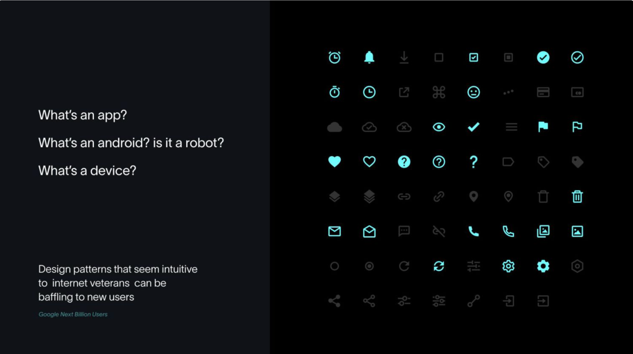
Design pattern histories

A rough transcript of the talk that I gave at the virtual day of Design Systems Day on Wednesday 11 October 2023.
I love things that help us track changes in tech. One recent example is the Jim Windolf's New York Times Article "The Rise of Tech, According to Sandra Bullock films". It reminds us not only that we rise over a technology adoption life cycle (Windolf points out how the 1995 The Net 'she’s skilled enough in the ways of the internet to pull off something that seemed novel at the time: ordering a pizza online. The camera lingers on the process, lending the scene the feel of an instructional film') but also that not everything moves at the same pace of change (to this end Stewart Brand's pace layering is particularly apt).
Meanwhile, for those of us who are involved with computers, we will smile ruefully in recognition of a 1998 quote by programmer and author Ellen Ullman:
“We build our computer systems we way we build our cities; without a plan, on top of ruins.”
Enter design systems.
They promise order, consistency, and 'best practices'—one hears that phrase a lot—to help us make design decisions: a promise of order.
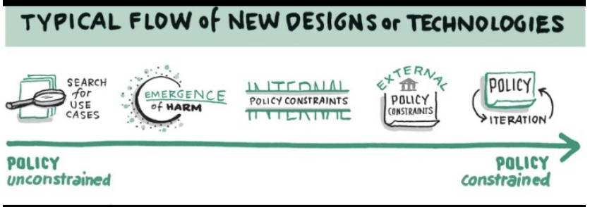
However, looking into how said patterns became codified shows how much disorder or at least potential for change still lurks in these patterns.
Design systems against Cynefin?
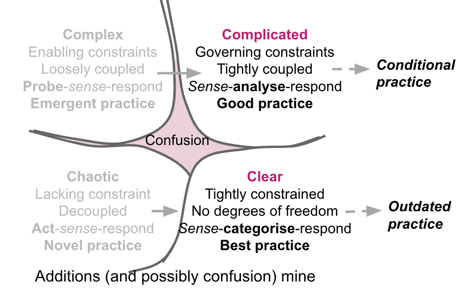
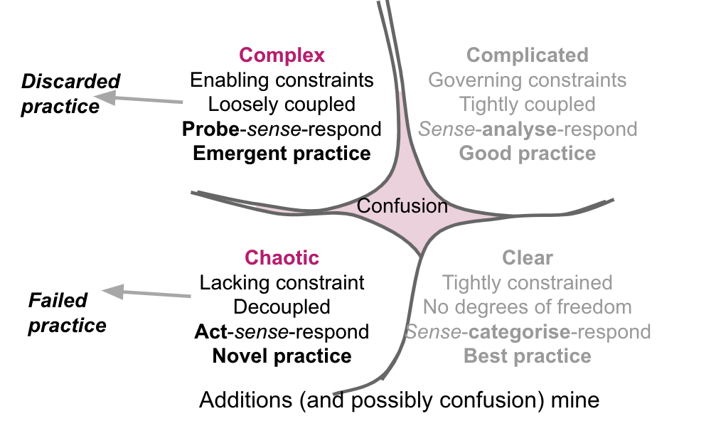
The decision making framework Cynefin talks about solving problems as a quadrant model (with confusion in the middle) and the type of practice that it entails:
- Novel practice (chaotic problems that just need initial action)
- Emergent practice (complex problems that require probes)
- Good practice (complicated but orderly problems solved by experts)
- Best practice (clear problems that can be solved with a recipe)
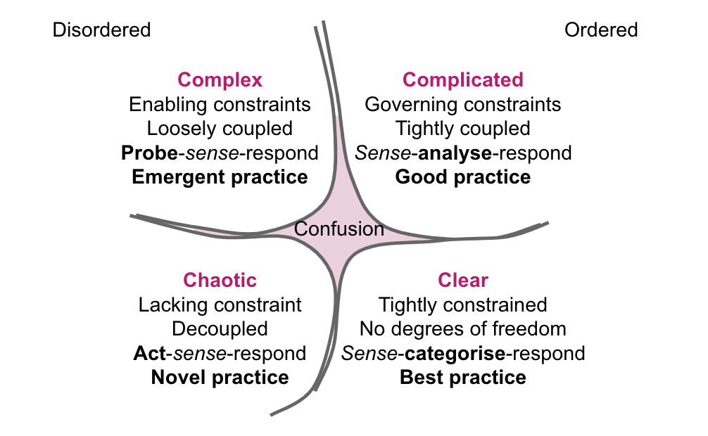
Design systems normally fit into the good and best practice area (ht Tim Paul for this suggestion from the talk on design principles he and Jane Martin did for Services Week earlier this year).
However, I'm keen to try using this model to unpick how patterns emerge and what that means.
A few disclaimers:
- I am going to use design patterns somewhat broadly to cover features, interaction patterns and UI patterns. This is also something of a personal gallop through the history of interfaces and Cynefin so all mistakes are entirely down to me.
- I'm using a lot of government patterns as references—this is partly as I know this domain, and partly as government does an excellent job of actually documenting changes (more of this everyone!) I wish I could have fit in some examples of the excellent Yahoo Pattern Library (something of a forgotten part of history but deeply influential for anyone doing web design in the 00s) but that will be a talk for another day.
Novel practice* - figuring out how to do something and seeing if it sticks
*Compared to the novelty of new technologies, design patterns may only ever be a combination of novel and emergent.
At the start of any new innovation is figuring out how to do something
Digital file management (around 1981) - the start of personal computing
So much of what we see on the computer screen can be traced back to the Xerox Star. A 1989 retrospective of the Star (available on Researchgate) helpfully helps us see what was available. It's almost shocking to see how so many things are similar.
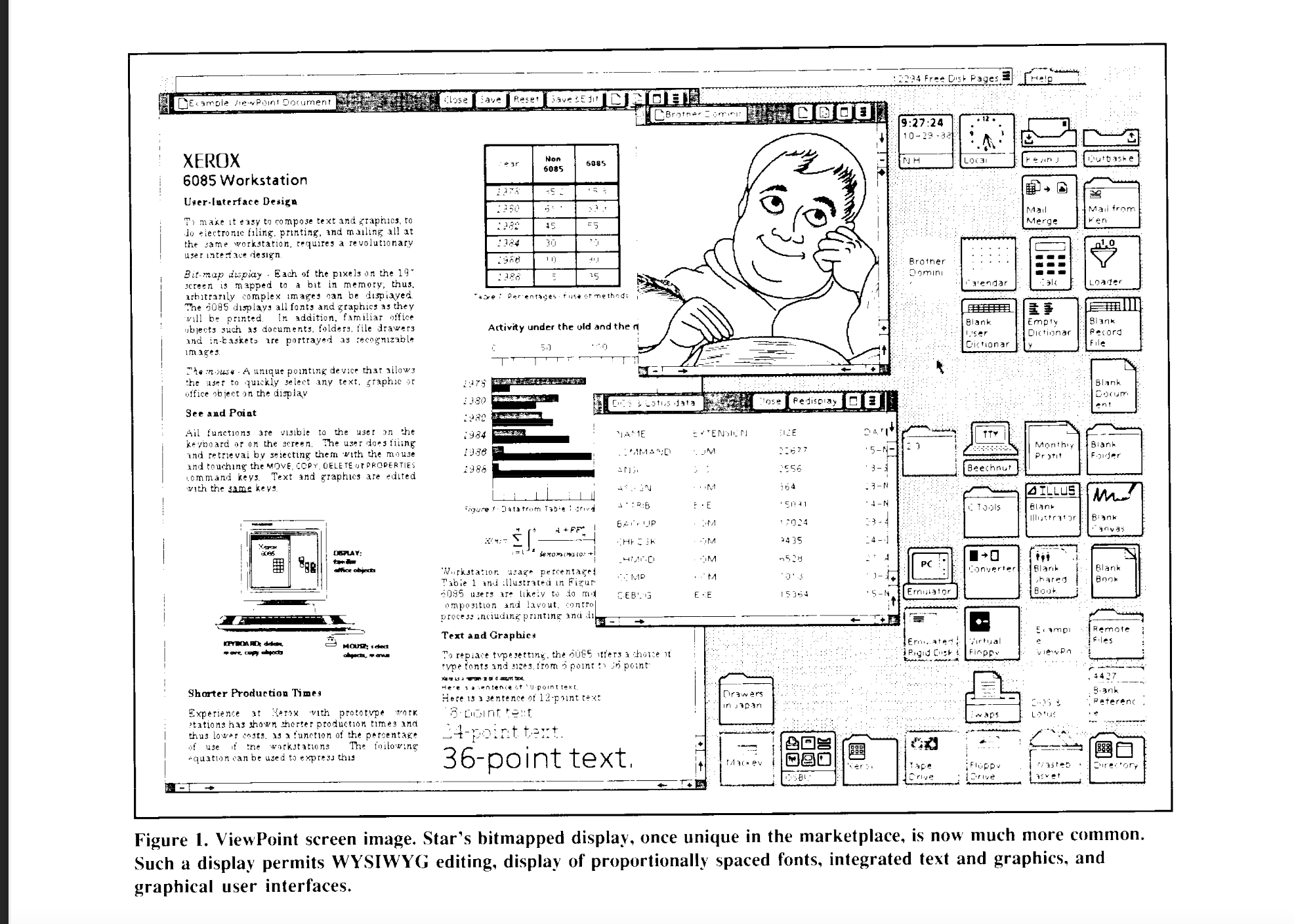
The paper notes Star's observations of user needs:
Computer users often have difficulty managing their files. Before star existed, a secretary at Xerox complained that she couldn't keep track of the files on her desk. An inspection of her system revealed files named memo, memo1, memo071479, letter, etc. Naming things to keep track of them is bothersome enough for programmers, but completely unnatural for most people.
It responds to this by both creating icons:
Star alleviates this problem partly by representing data files with pictures of office objects called icons. Every application data file in the system has an icon representing it. Each type of file has a characteristic icon shape. If a user is looking for a spreadsheet, his or her eye can skip over mailboxes, printers, text documents, etc.
It also allows for spatial organisation:
Furthermore, Star allows users to organise files spatially, rather than by distinctive meaning. Systems having hierarchical directories, such as Unix and MS-DOS, provide an abstract sort of 'spatial' file organisation, but Star's approach is more concrete. Files can be kept together by putting them into a folder or simply by clumping them together on the Desktop, which models how people organise their physical worlds. Since data files are represented by icons, and files are distinguished by location and specified by selection rather than by name, users can use names like memo, memo1, letter, etc, without losing track of their files as easily as they would with most systems.
The hamburger icon (around 1981) - menu management
Also part of the Xerox Star was the hamburger icon.

It was designed to represent a stack of files (who knew?) and was part of the Apple Lisa, and early Microsoft interfaces. It disappeared until it resurfaced again when mobile interfaces and their respective screen constraints made its compact nature seem valuable.
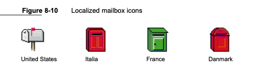
Email inbox icon (1980s) - start of electronic communications
Also part of the Star was the email inbox icon. While email slowly became more of a thing in the upcoming decades, the metaphor of a mailbox meant the need for some localisations.
For example, the 1992 Apple Human Interface Guidelines give instructions how the mailbox could look in different countries.
Pull-to-refresh (2008) - using touch devices
More recently, the iPhone revolution also brought in new patterns. While pull-to-refresh is now everywhere, I'm old enough to remember the app and developer that created it (the Tweetie app by Loren Brichter).
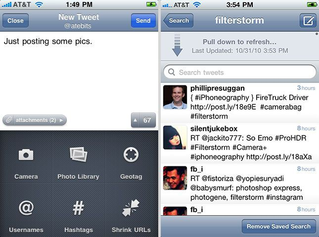
It was just so delightful that the pattern took off (aided by Brichter getting a patent but not enforcing it). Interestingly, there were some discussions later as to whether this really solved a problem and that instead interfaces should automatically refresh, however the pattern is still alive and well today.
When a design can use an existing metaphorical scaffold, it's easier to align on an direction. However, some things have to push through initial resistance as people don't initially have the tools to grasp the value.
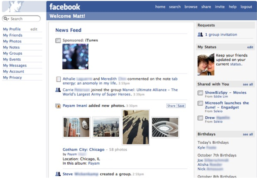
The news feed (2006) - start of social network graph
It's also easy to forget that the idea of a social media feed was once invented. It's well documented both in Clive Thompson's book Coders and a 2016 World Economic Forum blogpost about 10 years of the feed, but the reminder is that the newsfeed was created to push news to a person rather than them have to go to a person's Facebook profile. The change was so different that there were petitions and online protests. But Facebook held firm that it was a good thing, and the protest went away.
And yet some ideas never quite 'take'…
External link icon (submitted to Unicode consortium 2006)
Early versions of GOV.UK had an external link icon but then it was removed in 2016. The explanation as to why includes that it was ambiguous and better to just say in text.
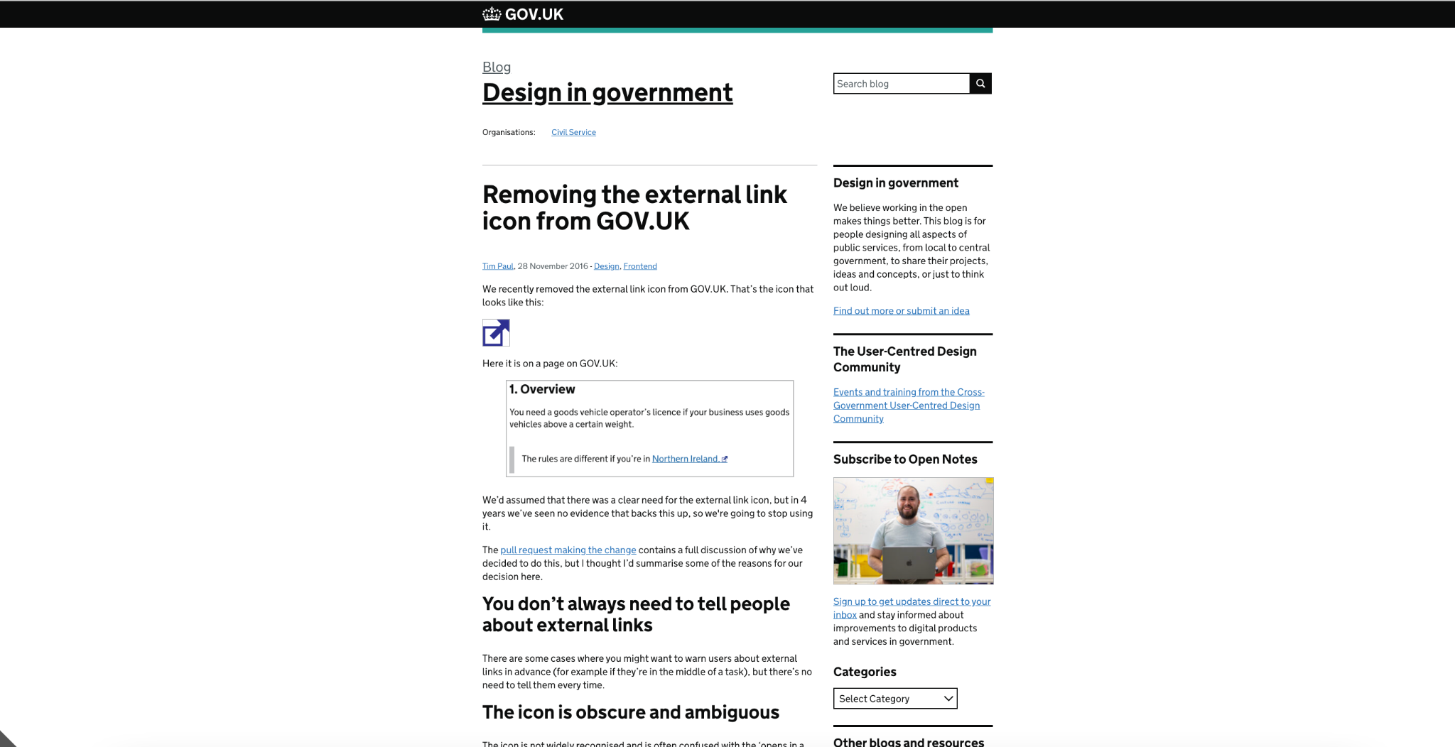
However, in general this icon hadn't really managed to get full support. A blogpost by tech educator David Foster laments that the icon got submitted to the Unicode Consortium back in 2006, and was rejected in 2012.
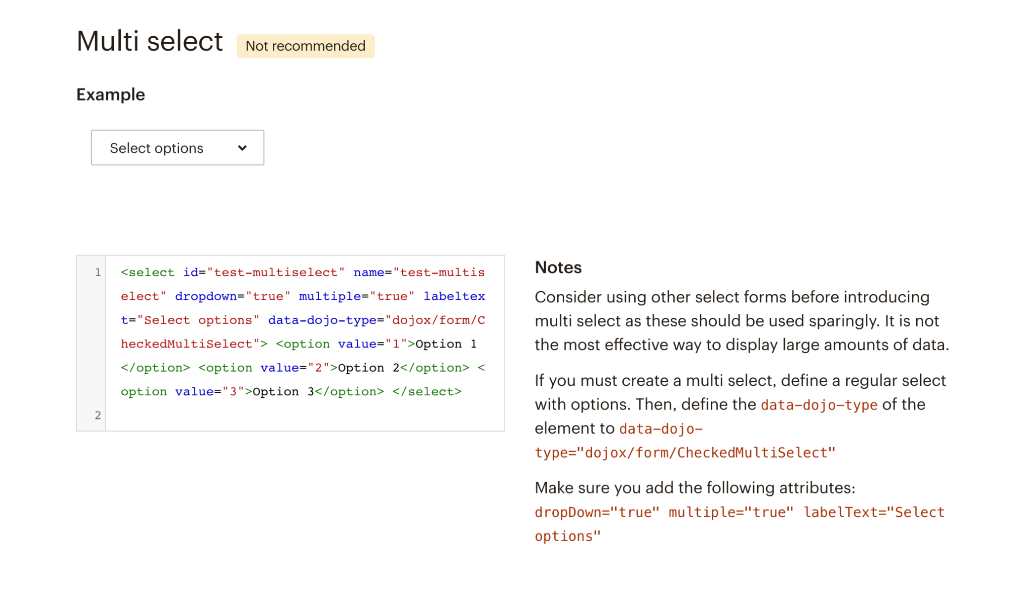
When novel(ish) practice ends up in design systems
It may be based on a ‘right place right time’ hunch rather than research: be careful about making assumptions as to its universal 'rightness'.
Emergent practice - balancing top-down and bottom-up approaches
When something is emergent, people need to explore different solutions in parallel and then somehow coalesce.
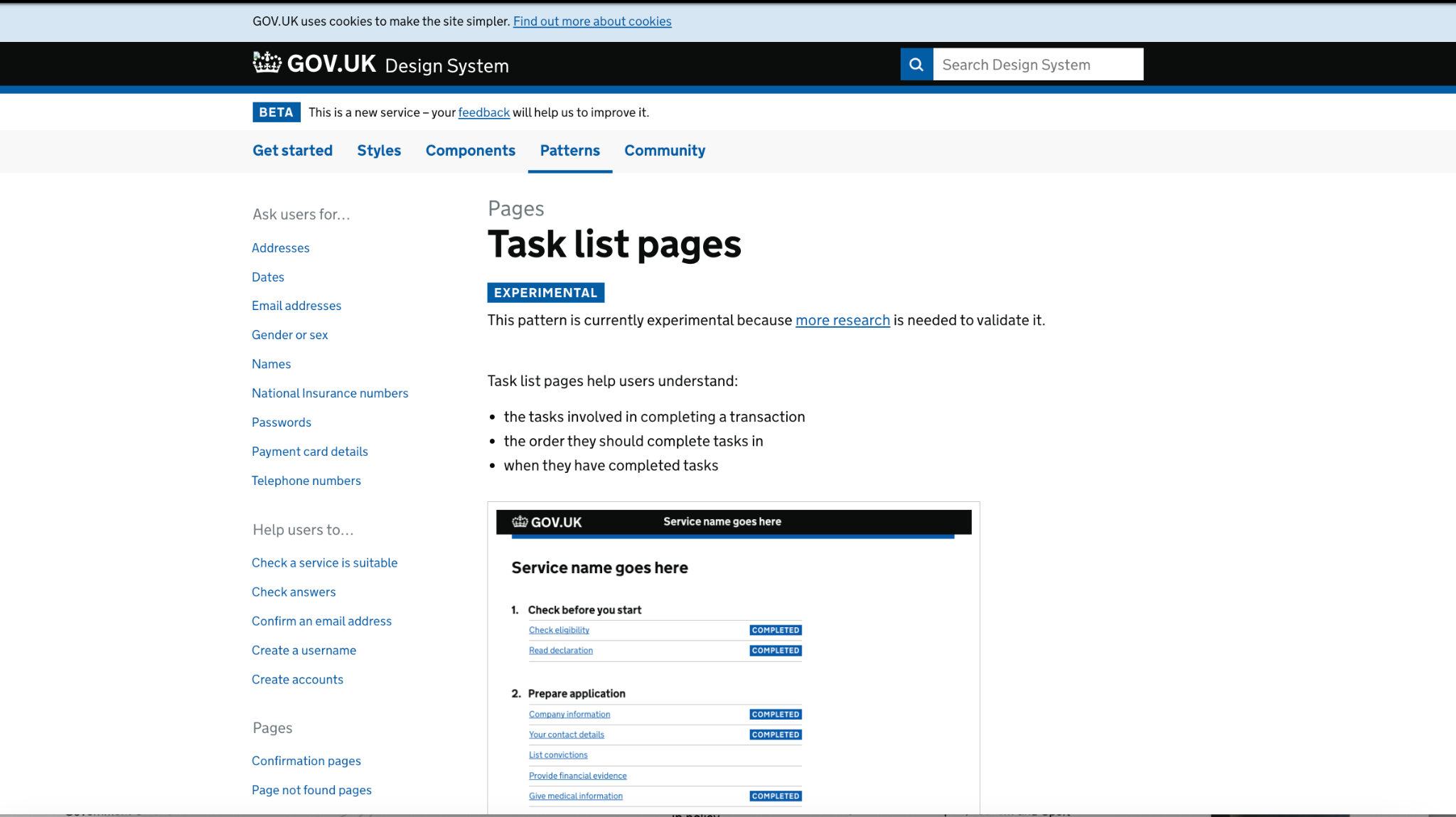
GOV.UK task lists (2017)
When I started working in government in 2015, I inherited a few services that had tasks in them created by a designer. Meanwhile, another service had an entirely different type of pattern.
In 2016, GDS announced that they'd created an experimental task list pattern. They had collated a lot of examples:
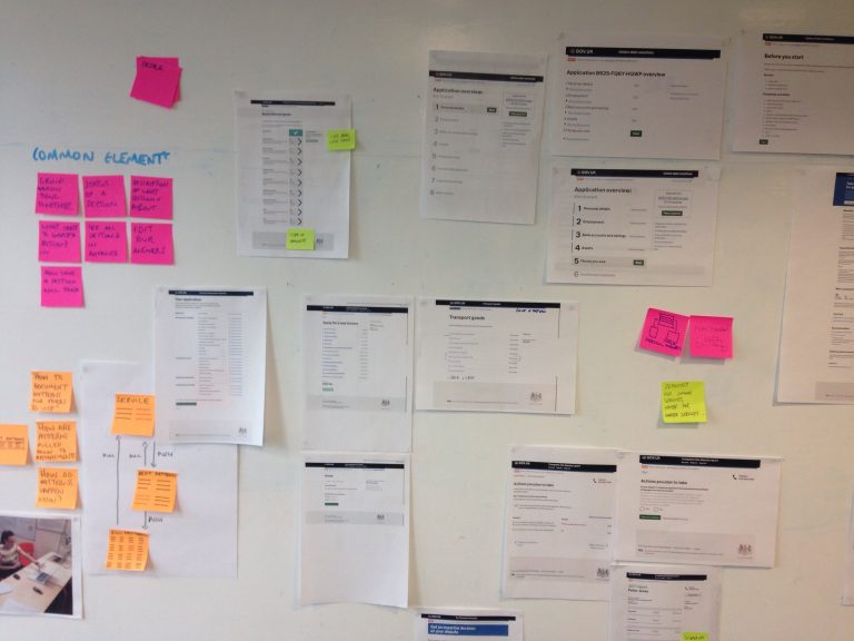
From this they created a page (snapshot on archive.org)
Interestingly, experimentation was still happening independently. One early example got stripped back by Martin Underhill to align with the published, then both more states added and the task styling stripped back more to have less visual attention.
Meanwhile, the general pattern had been updated to have a new 'incomplete state' and is now currently being worked on as a community group. (In fact a session later in the day shows how much the next iteration will change).
When emergent practice ends up in design systems
Look for where the alternative patterns get tended and documented. For example, in the early days of the GOV.UK Design System (which in fact started on a heroku app called GOV.UK Elements) there was also an open wiki called Hackpad. This got decommissioned for an official Github issue queue, with some departments also creating their own design systems for either department scoped problems or candidates for the more general GOV.UK Design System.
Good or best practice - accepting that patterns can degrade
In the Cynefin model, good practice is where experts can solve problems and best practice is where anyone can do it with a template or recipe. This is where design patterns are supposed to deliver the most value.
However, exposing ‘best practice’ to new situations could make it merely ‘good practice’ or even ‘emergent’…
App icons - assumed familarity
One thing from the Verge documentary about the Lisa was a note from the reporter that some of the Lisa's desktop metaphors feel overly literal today.
However, this is based on the assumption that all users have been on a similar journey of familarity with apps. In comparison, Eilish Out-O'Reilly found that designing for users with an average age of 80 meant that a lot of assumptions were no longer valid.
Similarly, ‘good practice’ or ‘best practice’ in one context might not work in another.
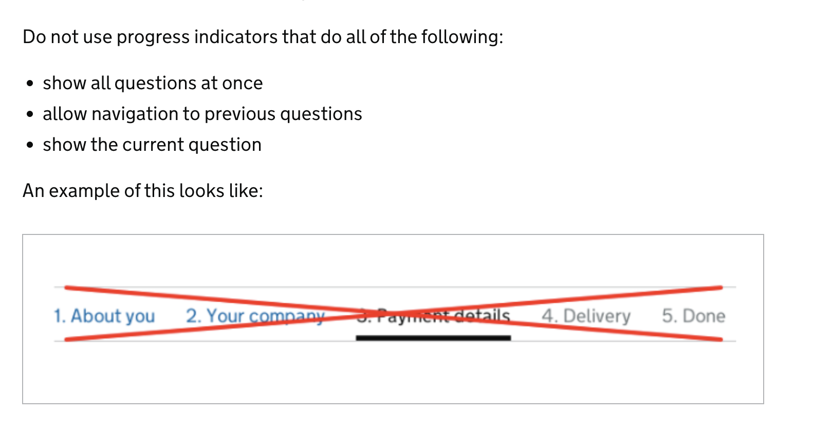
Progress indicators - only good in some contexts
Progress indicators (think the Amazon shopping cart indicators) are a standard feature of e-commerce. They have a documented need in this context: shoppers need their expectations managed so that they don't drop out.
With this in mind the early GOV.UK Design patterns included a progress indicator.
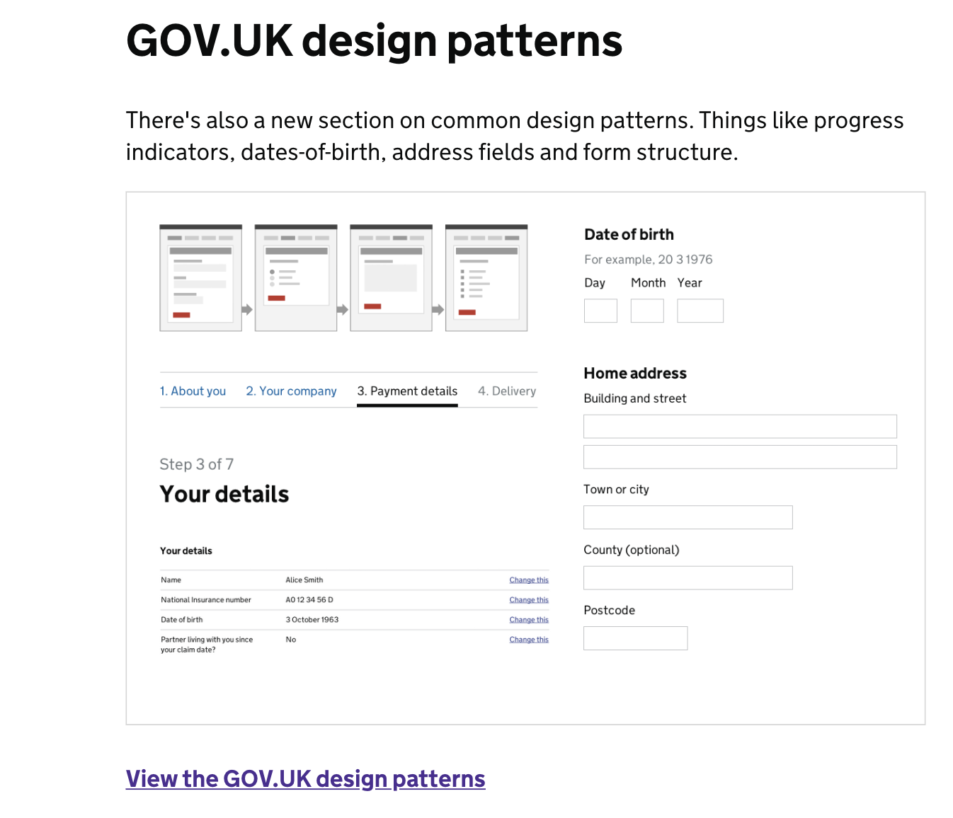
However, when Carer's Allowance tested the pattern, they found that it didn't work in a government context.
… the progress indicator we had designed wasn’t being seen by most users. In fact, those that did notice it were getting confusing about what it did, and others were even feeling intimidated when seeing it.
With this in mind we removed the progress bar as an experiment on the live service. We then measured the difference in our completion rates. We found that without a progress bar, completion rates stayed exactly the same while other key metrics, like time to completion and the total amount of online applications, were also unaffected.
The GOV.UK Design System questions page guidance now tells people not to use progress indicators.
However, some things just look too good not to use…
GOV.UK accordions (2018) - easier to use than do the hard work to make it simple?
The GOV.UK Design System has an accordion component in it.
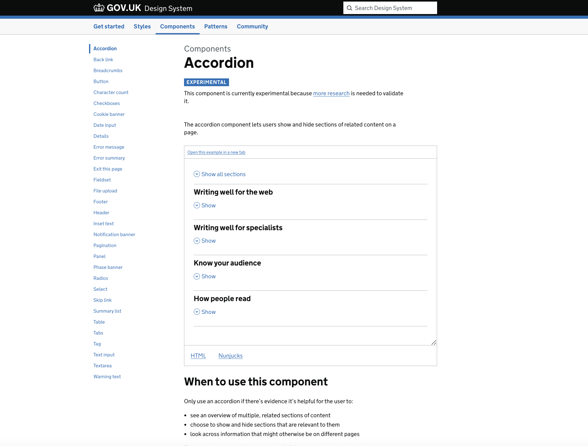
It is an experimental pattern and has clear guidance that it should not be used
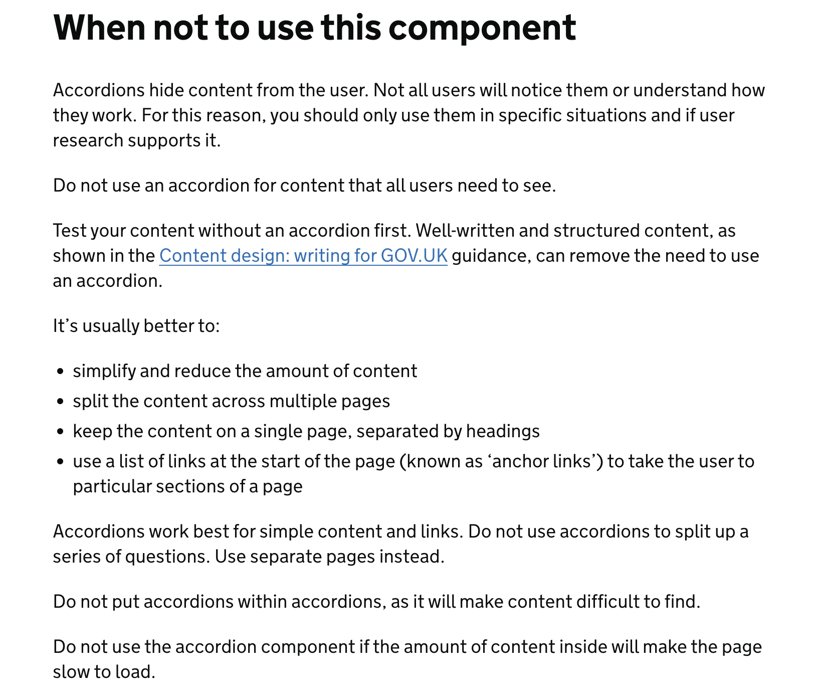
However they keep appearing in services. Part of my job is assuring services against the GOV.UK Design System, and I keep having to put in comments that the accordions should only be used if the team has tried other options first.
Carousels - bad but you have to look for it
If you need a reason to try and encourage someone to not use a carousel (the changing things on some news sites) try shouldiuseacarousel.com.
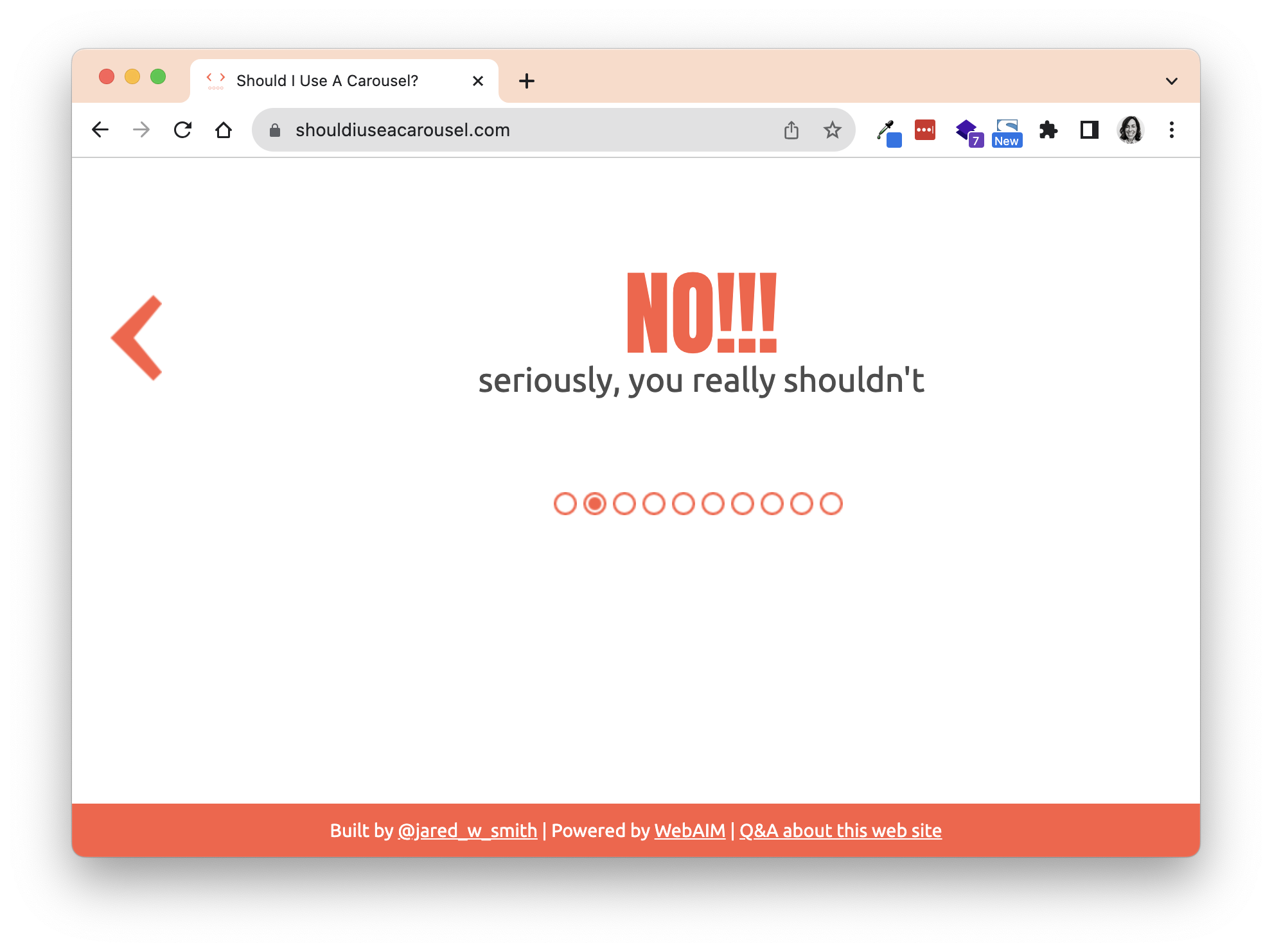
However, it's hard to find this information in official design systems. GOV.UK doesn't have any supported one but Bootstrap does. Hiding on the third line is the comment:
Please be aware that nested carousels are not supported, and carousels are generally not compliant with accessibility standards.
Big changes require both unlearning previous practice and doing rework
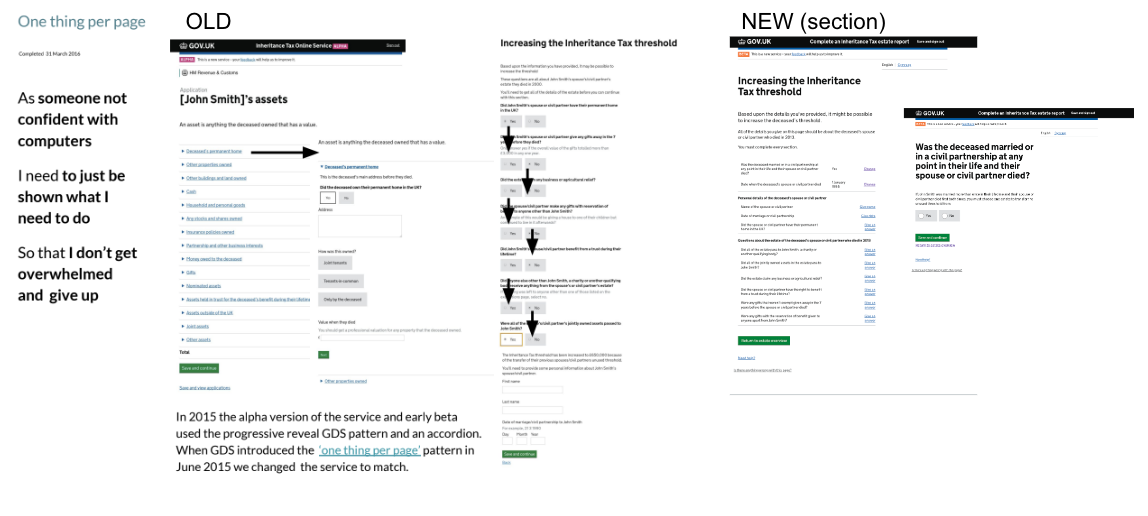
GOV.UK conditional reveal (2012) and one thing per page (2016) - cascading a new approach
Early services for GOV.UK were encouraged to use a conditional reveal' approach to questions. This meant that new questions appeared on the page.
However, this changed from being best practice to not recommended in 2015, with a blog post from Caroline Jarrett about it. It was replaced in 2016 by 'one thing per page'. This approach—to split pages up into 'things' (which could be a question but also could be things that made sense as one separate element, for example, details from your passport)—was designed to be easier for people who struggled with the internet.
I was on a service that changed this approach.
It was the right thing too: my user researcher did prototype testing where people with low digital skills would start off nearly shaking at the start of the session at the thought of filling in an online form and end beaming and saying "I'm really proud of myself".
However, over the years I noticed that people confused 'thing' with 'question' and also felt that they could never deviate from it. In comparison, the NHS Design System manual advises people to 'being prototyping from one thing per page'.
Regulation can be a kind of novel or emergent practice that disrupts ‘best practice’.
Alexandra Schmitt’s book Deliberate Intervention talks about what it means to use regulation.
Public Sector Bodies Accessibility Regulations (2018) - regulation means change
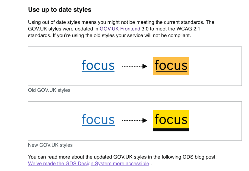
The Public Sector Bodies (Websites and Mobile Applications) Accessibility Regulations 2018 enforced that all UK new public sector websites had to meet WCAG 2.1 AA standard. Because of this, the GOV.UK Design System pushed out some changes to GOV.UK frontend to make it meet the regulations. They blogged about the changes and showed some of the changes such as colours on focus states.
However, this change is hard to find documented anywhere as 'evergreen' guidance. (In fact, I had to deal with this change recently when an accessibility consultant found a form that had focus states that didn't meet WCAG 2.1 AA colour contrast guidelines). To this end, I liked how the Department for Work and Pensions accessibility manual noted that older frontends might have this particular issue with focus states
WCAG 2.2 - more change!
The latest version of WCAG was released on 5 October 2023. This means more changes to systems.
When good or best practice is in your design system
It's only good or best practice for now.
Thinking about Cynefin and knowledge management, I think it's possible to see changes based on novel or emergent practice 'pushing' good practice to conditional practice, and best practice to outdated practice.
It's also worth remembering that even novel practice and emergent practice includes a lot of learning
But how to show that things have changed?
I've been looking at design systems and have found that Mailchimp's pattern library is thoughtful about showing changed practice. (It could be because the company in general has been responsive to understanding people, the book Design for Real Life by Eric Meyer and Sara Wachter-Boettcher describes how the company moved away from quirky instructional content after realising that people could be using the product while in a terrible emotional state).
I respect how they how components but make it easy to understand that it's not recommended.
Other examples for thought include Mozilla's Web Docs (again, thoughtful company) web documents which make it clear when components are experimental, deprecated or non-standard. (Also honorable mention for Shopify's Polaris).
Final thoughts about design pattern histories and some tips
I started the talk mentioning Stuart Brand's pace layers. His book How Buildings Learn: What Happens After They're Built is also a reminder of how even something as seemingly fixed as a house will grow and change over time.
To end, I have some tips for both those using design systems and those managing them.
For those using design systems:
- Be curious about where a pattern came from: if you’re going to challenge it then Chesterton's Fence—only take down a fence when you understand why it was taken up—is useful.
- Really try out a pattern. You may need to unlearn past expectations to really understand it.
- Test with a range of people. Even some previous ‘best practice’ may not work in your context.
- Share your processes, especially ‘failed experiments’. It will help others and even your future self.
For those that manage design systems:
- Cultivate and elevate feedback loops—especially when practice is emergent.
- Help users understand when and why of patterns. They may come across outdated practice and need context.
- Enable sharing and documenting - can it go on your organisation’s blog?
- Remind people that ‘best practice’ is only based on a moment in time and could change.
And finally, a quote from systems thinking pioneer Donella Meadows (2004)
we can’t control systems or figure them out. But we can dance with them!
Member discussion