Mapping the Way Forward, Richard Ingram
I’m sharing notes from UX Scotland 2014, which took place in Edinburgh Thursday and Friday this week.
Expanding on a blog post post he wrote a few years back, Richard Ingram highlighted a key feature of maps: they’re all subjective show whatever information is needed to fulfil a particular purpose. He avoided the obvious tube map example, but pointed to more political ones such as
- a seemingly perfect map of London by John Roque in 1776…that deliberately refused to map the impoverished areas of London.
- Walt Disney’s map of the future of Disney
Incidentally, a whole episode of This American Life is dedicated to mapping, with examples such as mapping a street against such metrics of pumpkin lanterns and local newsletter mentions, and how lawyers pay surveyors to map cracks on the pavement to allow for claims against councils when people are injured.
I’m also always reminded of the clip from the West Wing about showing how Australia is actually a lot bigger than it looks on the map
https://www.youtube.com/watch?v=n8zBC2dvERM?w=700
Or, as an Antipodean, this:
More practically, Ingram showed how mapping can help uncover problems in a UX project. He worked through a ‘case study’: by mapping different departments in an organisation against size and speed of getting things done, you might uncover a potential strategy for rolling out new projects. Even better, if you then start other maps (e.g. mapping the workflow of getting content published and finding stalling points), you can then contrast the two of them and help uncover problems no one was aware of.
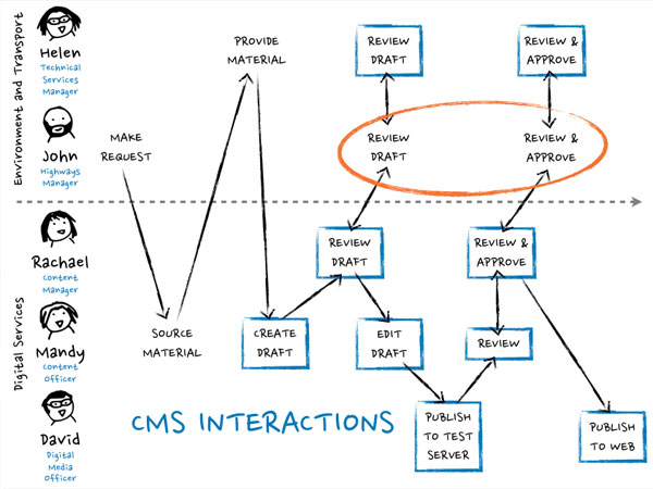
In the situation Ingram used, a block turned out to be because one large and big department actually had contractors who couldn’t access the content authoring system and had to give feedback via paper and phone calls.
As it turned out, the Ministry of Justice posted an article on this exact topic but with the very real situation of mapping their own service process.
He advised the audience to be careful about how the mapping is done: you should do it with stakeholders with pen, paper, post-its, whatever low-fi and quick materials are appropriate. If you do it on your own and present it, at best they may not identify with the implications, at worst they may not agree with you. Doing it with key stakeholders may also help key information come out (such as whether the map is actually wrong due to some extra insider information). Ingram was a big proponent of Dan Roam’s Back of the Napkin and encouraging people just to draw “as the people who are the least keen to draw often end up being the ones at the end who have the key information”.
Ingram’s slides are available on Slideshare.
Mapping the Way Forward UX Scotland 2014 from Richard Ingram
Member discussion