Style Guides & Pattern Libraries: A Foundation to Consistency

First up. I had no idea that Rob Whiting created the popular #uxdiscuss twitter sessions. Or was one of the people behind the designerhangout.co Slack group. Oops. I did know however that he is one of the organisers of NUX Leeds, hence why he was part of the NUX takeover at Dot York.
Anna Debenham’s styleguides.io rightly got a shoutout (it includes references to such guides as GOV.UK, BBC’s GEL and Google’s Material Design).
Whiting pointed out that there’s a lot of confusion between pattern libraries and style guides – as it turns out, a good way to understand the difference is to look at Mailchimp, who have both a pattern library and a style guide (the acclaimed Voice And Tone) freely available. The way I understand it from him is that a style guide can include a pattern library but a pattern library is not a style guide.
Confused? Whiting broke it down a bit more. He suggests that there 3 key elements of style guides:
- Pattern guidelines – the bit that we all know that shows the thing
- Use guidelines – ‘the why’, to ensure people understand context
“Pattern guidelines are the Frankenstein’s monster … usage guidelines are the spark that brings them to life” - Brand guidelines – the part that makes is specific to a particular brand e.g. British Airways rather than Ryan Air.
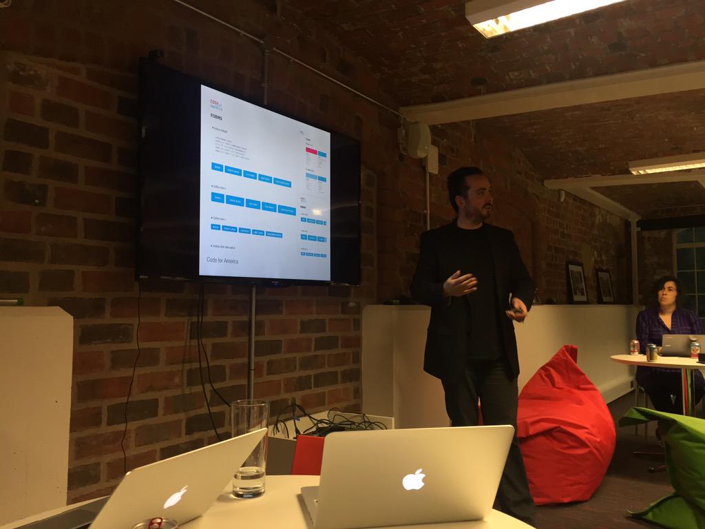
Style guides include 'the why' – the usage guidelines- to ensure people understand context @whitingx #dotyork pic.twitter.com/6iSFfjH2Bk
— Northern UX (@nuxuk) May 5, 2015
He suggested four guidelines to making good style guides:
1. Make it living (not separate, not dead)
Guides that aren’t tied to reality and can’t easily be amended will likely not get used. As Whiting explained on an earlier project:
I imagined that my beautiful and pixel perfect PDF styleguide would be used for years to come, but it ended up in a folder on someone’s computer.
He gave IBM’s design language as a great example. I also like Lonely Planet’s Rizzo.
Living design languages such as IBM give rich examples of use @whitingx #dotyork pic.twitter.com/592W1R0qR0
— Northern UX (@nuxuk) May 5, 2015
2 . Have things styled by default
Much as a good CMS makes your text look pretty from the get-go, things should style by default (or in dev terms you should put your boilerplate code in the usage guidelines). Whiting suggests that the guide still has a role, but is more there as a historical document, for on boarding new staff, or covering edge cases .
3. Think atomic
For example, start at button level and work up. Brad Frost has written at length about this concept. Personally, I’ve seen that Philips is doing some really interesting stuff in this space as well.
4. Make them organic
Make them in plain HTML if possible – CMSes can break and programming languages fall out of favour, but HTML is largely HTML. (Obviously, this is easier in an online style guide).
5. Make sure it remains collaborative
Ideally, people should be able to add to it or at the very least comment on it in some form of wiki system.
It’s useful to be able to see how a style guide has changed when people come into a project or have questions.
Member discussion