Apps for TV: How Tellybug does second screen
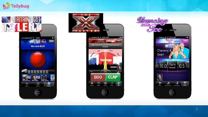
There’s been a lot of interest as of late in second screen apps. (Shameless plug, my work just did one for Aston Martin Racing!) While to my knowledge one of the leaders in experimenting with this to date has been BBC Research, I found out at UX Day that a standalone company called Tellybug has been the brains behind a series of second screen apps for ITV reality shows such as The Voice, The X Factor, and Britain’s Got Talent. Lead UX and UI Designer Chris Petty was on hand to talk through some of their unique challenges.

Most of our team are not the target audience
There were few people prepared to admit watching the shows that Tellybug is used for, but that wasn’t unexpected, as Petty explained, “most of our team are not the target audience: for The Voice it’s probably 14-16 year old girls”. This does mean that they can’t make assumptions.
They deal with this in a number of ways. They use personas to some extent, though also extend this to extreme users or “superfans” that the clients find through surveys and user feedback. A/B testing is also important to them, as it can show some counter-intuitive truths e.g. too much signposting of videos made the play count drop! They also do some usability testing as needed.
Being involved with a franchised event has some special considerations. While shows may seem to have a similar format, they have dramatically different tones of voice—the language used for rating in X Factor is different from the Voice—and can even change from season to season as judges drop in and out. Furthermore, they have to work closely with the franchise in case the system or timings change. Speaking of time, as an event they have to deal with high concurrent use of their app for a short period of time, “for a few moments each Friday we get more traffic than google.” which means a lot of load testing.
They’re also keenly aware that the app has to complement rather than overwhelm the primary experience of the TV screen: “if people spend 45 mins looking at their phone we’ve failed”. They generally do this through competitions, andsocial embedding (see what’s going on with twitter and add a comment without leaving the app).
Beware the Christmas device sale
Being part of a widereaching demographic also meant that they also had particular technology concerns. Generally they can follow the 80/20 rule for devices (80% of usage comes from 20% of devices), but they can get occasionally caught off guard. For example, the Christmas sale of Tesco Hudl’s last year meant that usage from that device spiked up and that they needed to be aware of that devices particular Android quirks.
As part of working with a franchise, they can end up dealing with different country versions of a show e.g. Indonesia’s got Talent. This also has different consideration in terms of devices: while the UK has far higher use of iOS than Android, other countries vary.
The team were refreshingly hard UX in doing wireframes before opening Photoshop, “In reality, the UX is never going to live up to your ideas of the UI”. Due to the reach of their app and importance of people involved, they then do a lot of Testflight testing internally as well as with stakeholders before finally releasing it.
This post is a part of series of posts for UX Day, which took place on 9 October 2014 at The CastleGate in Newcastle upon Tyne.
Member discussion