Building blocks of UX design – designing engaging experiences for children

I’m writing from Talk UX, the conference on UX aimed at getting new and differing voices heard.
The expression goes that you should never work with animals or children. But what if you’re designing for children? Mickela Perera shared insights on how to conduct user research with children as well as particular issues that occur.
One major consideration is that children are going to have expectations about tech unlike anything we’ve seen before. Many Millennials or Gen-Xers may remember having a desktop they were sometimes allowed to use with a parent. In comparison, 1 in 3 children today has their own tablet. (I’ve certainly noticed a number of toddlers with iPads in cafes over the last few years).
1 in 3 children have their *own* tablet – their future expectation is going to be … interesting @mickela_p #talkux pic.twitter.com/t16RkmC7ep
— Rick Threlfall (@rick_threlfall) March 5, 2015
More than anything, she emphasised that you have to account for children being far less forgiving of lengthy and potentially irrelevant tasks. She suggested that screening during recruitment to get appropriate children for a said app or activity is even more important than it is with adults, since a child who is being asked to test the interface of something they’re not interested to won’t play along the way that an adult might e.g. if you’re testing a brand app and they’re not interested in the brand they’ll just clam up (a waste of everyone’s time and money!). She also suggested that you can only expect a maximum of 30 minutes per session (though to be honest, even adults can start to flag after 20 minutes without appropriate prompting and guiding).
Even more so than adults, children of a particular age are concerned about saying the ‘right thing’ or what people will think if they make negative comments, so it’s key to emphasise that you didn’t make the app (even if you did) and that the people who made the app won’t find out that the child made those particular comments.
Funnily enough, almost all of the suggestions Perera made could apply to adults too, be it making asking for opinions more creative than a Likert scale (everyone likes stickers!), or ideally testing at a place familiar to them, or at the least making the testing lab feel more like a play space than a lab.
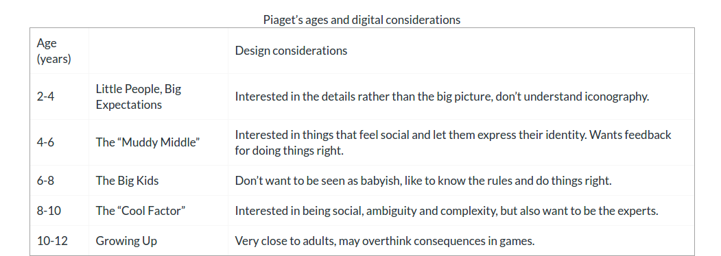
Having read Debra Levin Gelman’s book on designing for kids, some points that Perera made are particularly pertinent for certain ages. Wanting to appear to be giving the ‘right’ answer? The “Big Kids” stage (though to be honest adults can test like this as well). Same for needing context for questions.

Header image NC-BY-SA by Talk UX.
Member discussion