Putting the ‘design’ in content design
Design strategies for content work
As an interaction designer I’ve loved working with content designers. At best, a good content and interaction pairing are like an ad agency’s copywriter and art director partnership — the sum is more than the parts.
The analogy is apt since Sarah Richards, the person who created the role of content design, came from advertising herself. She explains that content design is about considering and designing the entire user journey through the lens of words.
Content designers take the whole user journey and work out what messages should be put where. Then they work out what emotion and language to use… Content designers will use any format: BSL (British sign language) video, tools, calculators, calendars… anything at all. Content designers don’t need to do all the work, they need to know what the user wants.
– How copywriting differs from content design, ProCopyWriters
The former Director of Design at Government Digital Services (GDS), Lou Downe, similarly notes that content design stretches across all parts of a service.
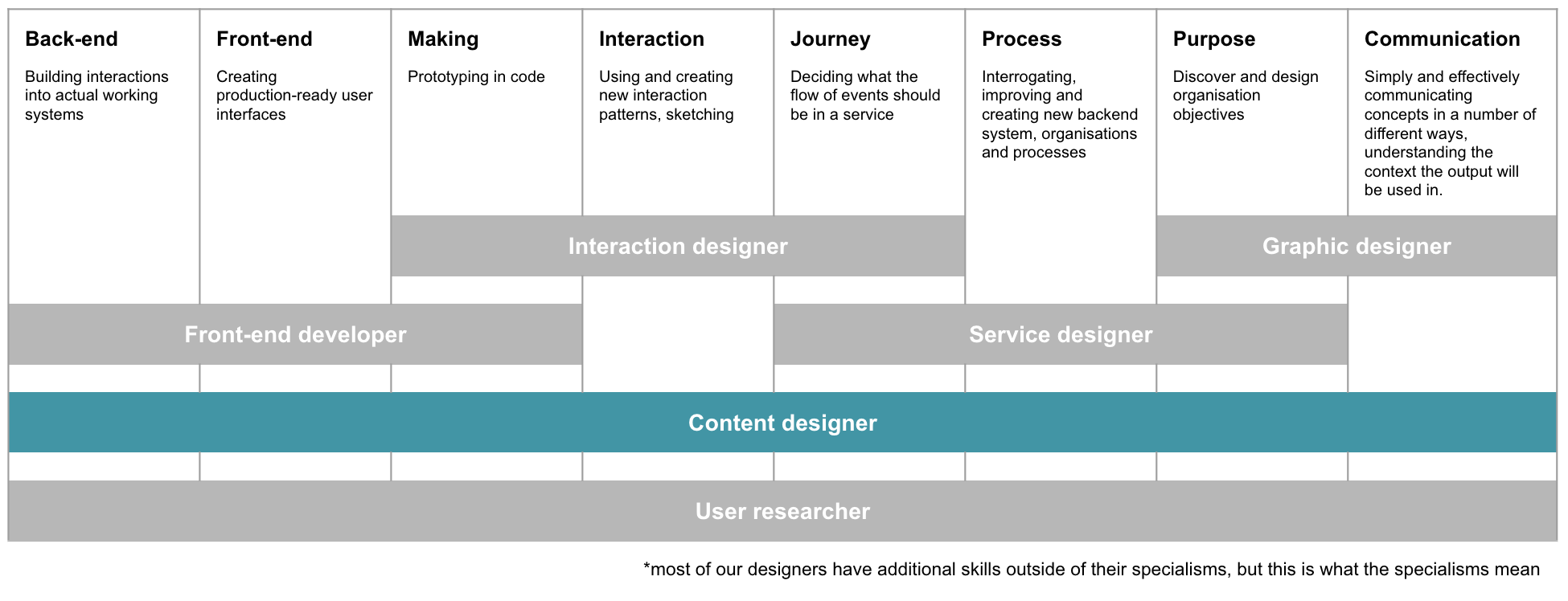
Types of design, with content designer highlighted. Adapted from ‘The Different Types of Design in Government’ by Lou Downe.
However, despite the name, most content designers I’ve worked have a different background from Sarah’s, or mine as a true-blue designer. They were formerly writers, journalists, or communications managers. This has made aware of many skills that I take for granted as a designer thanks to my background. This has included me comfortable with:
- quickly generating multiple concepts
- teaching myself technical skills
- using design to enable design
- thinking and communicating visually
I’ve turned these skills into actions for content designers to consider with their work in service teams, and for interaction designers (and others) to do to support.
1. Quickly generate multiple concepts
Content: make low fidelity content options
Interaction: create scaffolds for low-fidelity prototypes
During design school, one of my tutors old our class stories of graduates having to crank out 30 concepts in 3 hours. This forced creativity means I’m used to making things fast and moving on. However, this involves having the skills and tools to do it.
In my agency life as a UXer, we were encouraged to make hand-drawn sketches to show these rapid concepts. I don’t encourage this in the government world. While part is personal preference, it’s also because I feel these sketches prioritise visuals over content. I’ve also seen other teams do usability testing with sketched screens where handwritten content with spelling mistakes got in the way of useful results.
Instead, I prefer to work with a content designer to initially throw around ideas on a whiteboard, and then use collaborative digital documents to quickly work them through. In particular, I’ve found creating google docs of screens allows for playing with ideas before committing them to code. We’ve even done clickable Google Slides for usability testing!
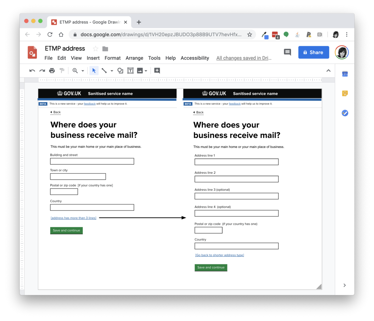
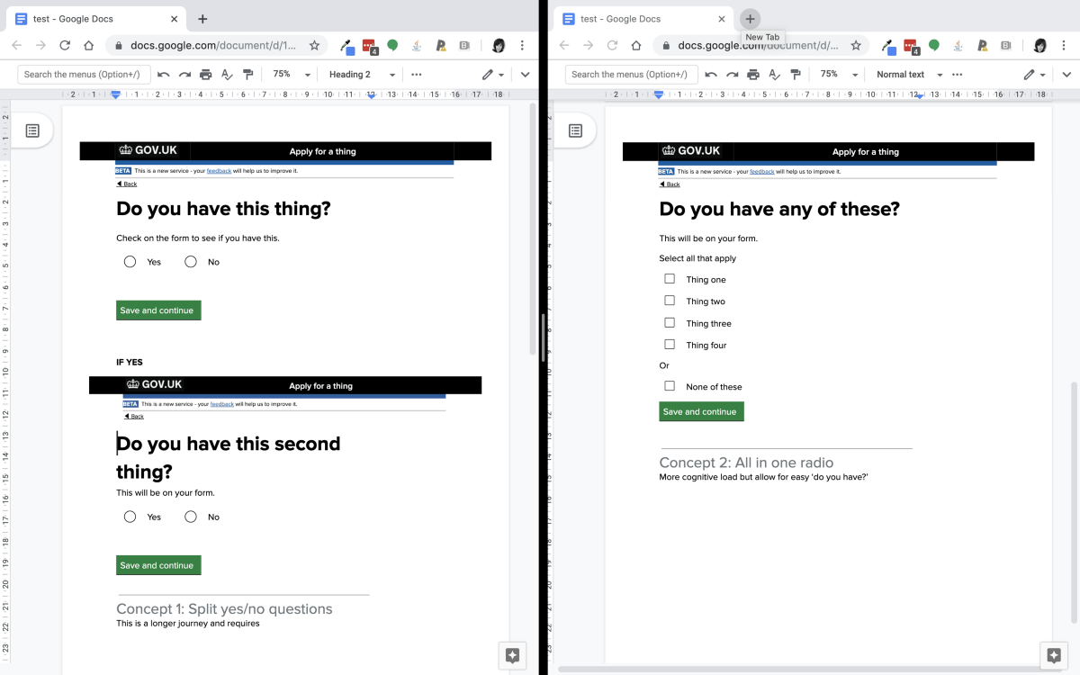
These aren’t meant to live on their own — at most, we might add context around them to explain the concepts and talk them through with teams. However, they allow for ‘sketching’ — loose and fast thinking — in a way that lets the content do the heavy lifting.
After years of cobbling together templates for doing these documents, I’ve created a modular template. (I’ve never shared this with other people as a template so do let me know if there are bugs!)
2. Teaching myself technical skills
Content: craft high fidelity content in the material
Interaction: support content designers to learn technical skills
In my product design degree, we were taught programs such as Macromedia Flash (now called Adobe … something), Photoshop and Freehand by a couple of lessons, followed by the tutor saying “there’s loads online, if you get stuck anytime, email me”. This method of teaching us the confidence to teach ourselves has served me well in my career, particularly as I learned to code. I also got comfortable with things breaking as I learned.
Generally designers on in government use the GOV.UK prototype kit. It is prototyping in code, using HTML and CSS/SASS for the actual screens, Express and node.js for logic, and a framework called Nunjucks for templating. Normally the prototypes are hosted online (for example, Heroku), and changes made using a versioning control system called Git (normally saved on cloud services like Github or Gitlab).
This requires some comfort with code, and even I haven’t mastered it all. However there’s a lot of documentation and support available, and knowing just a little can do a lot, especially for content.
Because of this, I’ve been dismayed to move onto many service teams to find that the content designer had to pass documents onto the designer to paste into the prototype. This is because no one had taken the time to get them using the kit. In some cases, other team members forbade the content designer from using the prototype in case they ‘broke’ it!
This means that after getting the content designer access to the appropriate repositories, I’ve got them set up with cheatsheets, supported them when they had merge conflicts and bugs, and most importantly, emphasised that it’s normal to break things and that I’ll break the prototype more that they ever will.
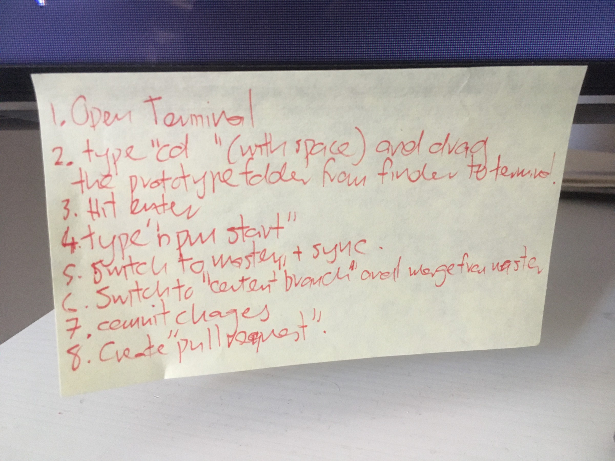
How we can support content designers getting beyond basic understanding – especially how we teach people how to teach themselves by things like knowing what to ask about online – is something we’re discussing at DWP. I don’t expect every content designer to be as fascinated with learning to code as I am. I do follow Lou Downe’s suggestion that designers need to understand the constraints of their medium. However, getting to further levels of mastery is an interesting topic.
3. Using design to enable design
Content: Prototype content of other people’s stuff (plausibly)
Interaction: Master the constraints of the materials and create scaffolds (again)
Many services have user needs that must happen before a service – on pages that aren’t owned by a service team. In many cases the owners of that content aren’t authorised to even start working on it until private beta.
In these instances, design is useful at opening up a conversation. If you search phrases such as ‘design futures’, ‘design futures’ and ‘provocatypes’ you’ll find a whole field on rendering speculation. For me, one of the best things I’ve done is prototype whole journeys as if they were my own. Bringing guidance, letters, emails, and even comms tweets into a prototype from alpha onwards, and taking care to respect constraints, enables intelligent conversations. It also lets the service team get a head start on trying out improvements.
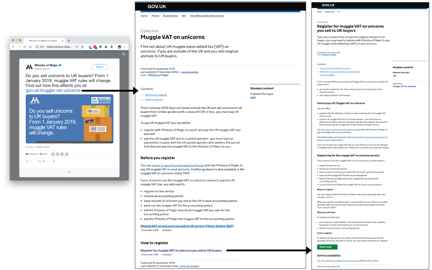
For me this has meant a few things:
- understanding the entrance a service will actually get (for example, if it has enough users to get a mainstream guidance page/mini-guide from GDS or a specialist entry from that department)
- prototyping options before a service, such as a check eligibility service, calculator, or step by step guide. As the prototype kit is HTML and CSS I can do this with a lot of fidelity.
- understanding enough of the restrictions of a format to make sure what we design is plausible. For example, what elements are available on a specialist guidance page, or what can be played back in a confirmation email
- framing the narrative on anything we design to allow it to be taken apart by the actual person who will ultimately remake it for real.
For content designers this also means a more considered version of ‘ask forgiveness not permission’: designing content as if they owned it, but also talking about it in the full understanding that they don’t.
4. Thinking and communicating visually
Content: design your stakeholder playback documents
Interaction: support on visual communication principles
During my years working as a designer in an agency, much of my work was about communicating decisions. Yep, all those PowerPoint decks! I got used to quickly creating diagrams and using visual design principles such as hierarchy and proximity to make them easy to understand.
This takes practice similar to content design in general:
- What’s the one thing you’re trying to get across? Do you need multiple diagrams.
- What’s the best way to present it?
- What is foreground (the thing that needs to be seen first) and what is background (the things that give supporting context)?
- Can anything be removed or simplified (for example, showing relationships using proximity rather than borders)?
I’ve used this to help content designers communicate to stakeholders important decisions, for example the components of a naming system.
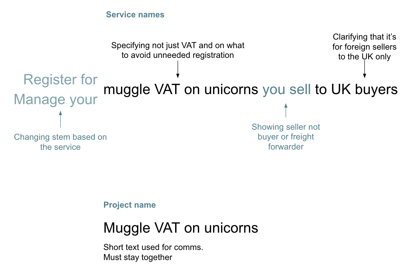
Using visual cues such as proximity and contrast to explain the naming system of a fictionalised service
Conclusion: you shouldn’t be able to tell where the content stops and the interaction begins
Over the last few years I’ve design assessed many services. I’ve started to get a feel for when the content designer is being treated like a copywriter. This is when copy seems pasted onto screens and there’s a lot going on. It makes me sad when I see this. Designing together is a messy and sometimes exhausting process, but the result is a cohesive and muscular product, with the right information at the right time and nothing else.
Further reading
- Richards, Sarah, and Kristina Halvorson. Content design. London: Content Design London, 2017. Print. An obvious primer that articulates the jump from copywriting to content design (though PS Sarah your book’s margins are far too small, the text can’t breathe!). Sarah Richard’s article on the definition of content design is also a good primer. Amazon UK link.
- Kolko, Jon. How I teach: reflecting on fifteen years in design education. Austin TX: Brown Bear Publishing, 2017. Print. A good distillation of the design education you never had. It’s available as a book and also for free as a website (though the website currently is a security risk). Amazon UK link.
- Roam, Dan. The back of the napkin: solving problems and selling ideas with pictures. London: Marshall Cavendish, 2009. Print. A good primer on different types of diagrams for framing concepts. Amazon UK link.
- Tufte, Edward R. Envisioning information. Cheshire, Connecticut: Graphics Press, 1990. Print. The best of the Tufte books for understanding how to make diagrams. Amazon UK link.
- McCandless, David. Information is beautiful. London: William Collins, 2012. Print. Some diagrams go too far into style over substance, but a good resource for how to visually communicate things. Amazon UK link.
- Duarte, Nancy. Slide:ology: the art and science of creating great presentations. Beijing Sebastopol, CA: O’Reilly Media, 2008. Print. From the people that did the slides for Al Gore’s An Inconvenient Truth.
- Gov.UK prototype kit tutorials. Information about installation and how to do the basics. For years the tutorial was only available via a secret link or from the in-person training, but it’s recently been added.
- Content types: GOV.UK. Not comprehensive but a good start for understanding what’s available on the GOV.UK Whitehall Publisher platform.
Member discussion