Turning Clicks to Sales: Review
I was recently invited to take part in a presentation from the Marketing Industry Network and Orange Bus on Converting Clicks to Sales. Since my participation was only on the panel, it gave me ample time to take notes (though not sketchnotes this time around).
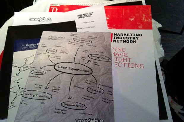
And also check out the schwag.
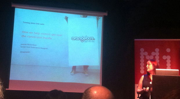
User Experience and Persuasive Design — Joanne Richardson
Richardson gave a useful 101 on how UX can be relevant in an e-commerce context.
Some of her points:
UX is “the quality of experience a person has when interacting with a specific design”
Similarly
“UX design is research, planning and verification of a solution”
Investing in UX can give a company confidence in design (as it’s backed up by research) and clarity in direction.
Customers and Persuasive Design
Customers go through a journey of use: unaware>interested>first time>regular>passionate (for more on this see people such as Joshua Porter)

Some tips:
- Design has a big impact on whether people trust a site enough to buy from it. In a 2004 study, 83% of people tested rejected a health site because of its look.
- Reassure them (they haven’t bought yet!)— Amazon is good at this in stressing that pushing the next buttons won’t charge your credit card
- Create demand (ala Groupon); add constraints
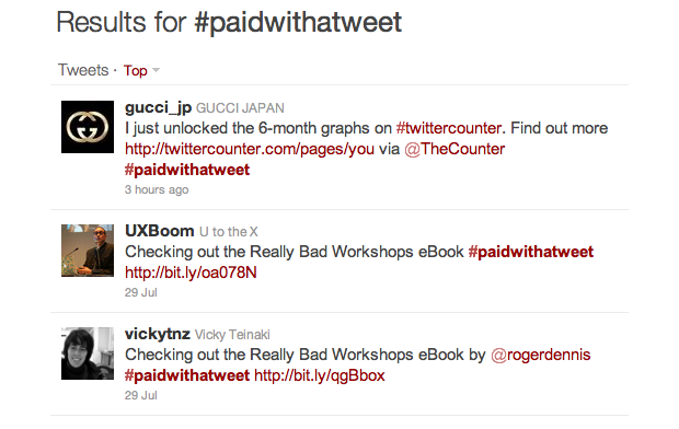
- Incentives, everyone loves a bargain. Sweden has lottery where people can win the traffic fines. The online equivalent : #paidwithatweet
- Social Proof: Expedia use this really well (last booking), also Amazon’s recommended books
- Social good and social giving
- Achievement (badges etc)
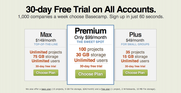
- The Goldilocks effect: have a low and high option so people can go for the middle.
- Remove barriers — people are inherently lazy! — Tumblr and Posterous both let you creat a blog without giving any information.
Tom Fotheringhan — Conversion Tips
Fohteringhamn gave a fast and data-referenced-to-the-hilt talk on conversions.
Top conversion killers ranging from most to least are:
- Verified by Visa (Amazon is paying huge fines in not implementing it, but apparently believe that it’s not worth the loss)
- Discount codes (people will go to Google to search for codes and forget to come back),
- Forcing people to log in (instead allow for anonymous purchases and register later on)
- Weak buttons (making it hard for consumers to see where to click)
- Confusing payment channel (funnel, don’t throw extra things at customers when they just want to buy it!)
- Decision paralysis (don’t give too many options!)
- Hidden charges (airlines were the worst for this, but now state prices upfront)
- Slow loading pages (not only can this affect Google ranking, but it can drive customers away if they have to wait too long)
- Poor product pages (if it’s difficult to figure out how to buy, or find out the things customers need to know to make them buy)
- Having out of stock products (a shopfront of out of stock products doesn’t encourage trust as it implies you can’t manage your stock)
Tips:
- Share the love (get people to connect with Facebook or Twitter eg like for free delivery etc)
- Recommendations (e.g. Online clothing shops benefit from customer reviews that say how products fitted etc)
- One click to products (many sites don’t do this. Make it easy to get to the product!)
- Filters (make it easy to search)
- Run split testing (this enables you to try different techniques and see what works);
- Record your best sales person (listen to what they say and do, and then apply it to your site!)
- Run instant chat for two weeks (you’ll catch people who wouldn’t call a hotline)
- Monitor fall outs (this is easy with various analytics tools, many such as Google Analytics are free)
- Run usability tests ( tools you can use include Clicktale, Crazyegg, and Whatusersdo)
- Ask for feedback
- Test for conversion not design (it’s not about the site aesthetic as whether it works).
- Set up urgency (time limited sales etc)
- Hit the magic moment (timing)
- Use breadcrumbs
- Show progress
- Consider your imagery (different photos can give different responses)
- Think about using videos (these can be very successful, especially if your product is difficult to understand)
- Show what people are missing (eg dating sites don’t show more info.)
Top 5 free traffic ideas
- Flash sales (i.e. The Groupon model. use a deadline to encourage people to make a decision)
- Facebook ads (they have really fine-grained control e.g. age, location, alumni; and are cheaper than google)
- Coupons (use for slow days e.g. mid-week)
- Think ahead, ride the media wave (what events are coming up that you can plan for? Orange planned ahead for their very popular Royal Wedding spoof vid)
- Online competitions
Member discussion