Working on government communication and collaboration services
I’ve spent 4 months working on internal Collaboration and Communication Services (C&CS) at the Department of Work and Pensions (DWP). These are services that are internal facing and generally bought consumer-off-the-shelf. These include the intranet, chat and video conferencing services, and document management systems.
It’s been a learning opportunity for me since:
- it was my introduction to a new department after working in tax for nearly 4 years. DWP has a lot of citizen-facing staff, the tax department doesn’t.
- In my previous department I’d had little visibility of their internal systems so also came into this area from a position of ignorance.
- as someone who has lived in the UK for less than a decade (for most of which I wasn’t entitled to benefits let alone claim them), I also didn’t have any domain knowledge of the UK benefits system.
- my role was undefined as I joined a new cross-cutting C&CS UX team of a product owner and performance analyst. There was also a user experience squad based in Manchester, but their remit was more broad than ours. The C&CS cross-cutting UX team had an opportunity to look at the C&CS suite in more detail.
What I worked on and what I learned
Experience prototypes for a front-door process
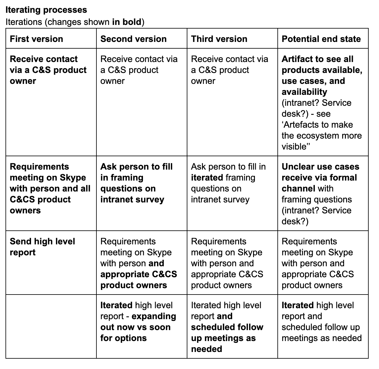
The crosscutting UX product owner had a hypothesis that people asking for C&CS products often weren’t asking for the best product since they didn’t know what was available. To start to investigate this we created a service prototype for a front-door process with the core of a conversation.


Things I learned from this were:
- prototyping processes is interesting! As an interaction designer, I’d never started with something with a conversation at the core as we did with the front-door process. Beginning by orchestrating a conversation and then building the structure around it is a very different dynamic, faster and more natural.
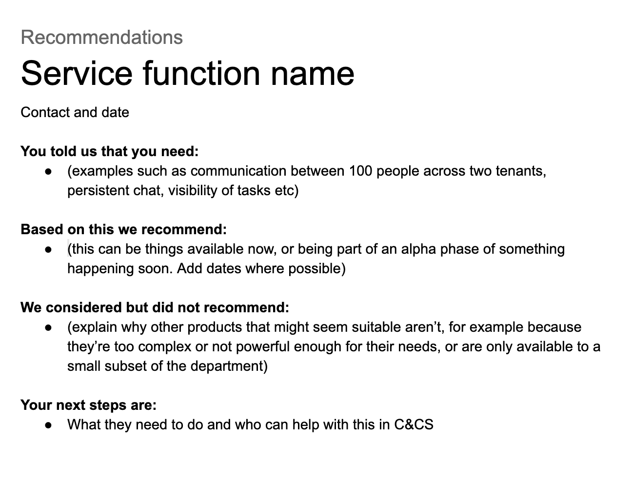
- advising people is as much about telling people what you don’t recommend as what you do. I took my report format and other artefacts to the cross-government design critique day in Newcastle. The designers commented on the value of spelling out why a particular product that might seem to be a good fit wasn’t.
- in the absence of visibility of what’s available, colleagues use existing systems to breaking point. As a designer, I always have respect for people’s resourcefulness. However, part of the process is giving people the tools to understand that they have better options available. Which leads me to…
Artefacts to make the ecosystem more visible
We investigated ways to show what C&CS products are in-flight, from assessing to sunset. We created a dirty ‘product matrix’ from an Excel spreadsheet, and used this to investigate categorisation and overlaps. In future this sort of artifact could be something used as part of the front-door process.
Things I learned from this were:
- making the thing is as important as having the thing. This is a paraphrase from Sophie Dennis quote about strategy that “making the map is as important as having the map”. Making the product matrix enabled discussions about what tools did what, and how they fit with each other make duplication and gaps clearer. My prototype may disappear or becoming something completely different. However, having it as a conversation piece has been hugely useful.
- sometimes making a thing is the best way to find out that another thing already exists. As part of making the product matrix and asking around, I found an HTML tech radar for technical architects which did a similar thing. However, it was very out of date and no one knew about it. It was only through further investigation that I found out who could update it. It may be when the tech radar is up to date that the product matrix has no purpose. However, as most of my team didn’t know about it, it was only the process of making something similar that helped me find it.
Vision stories
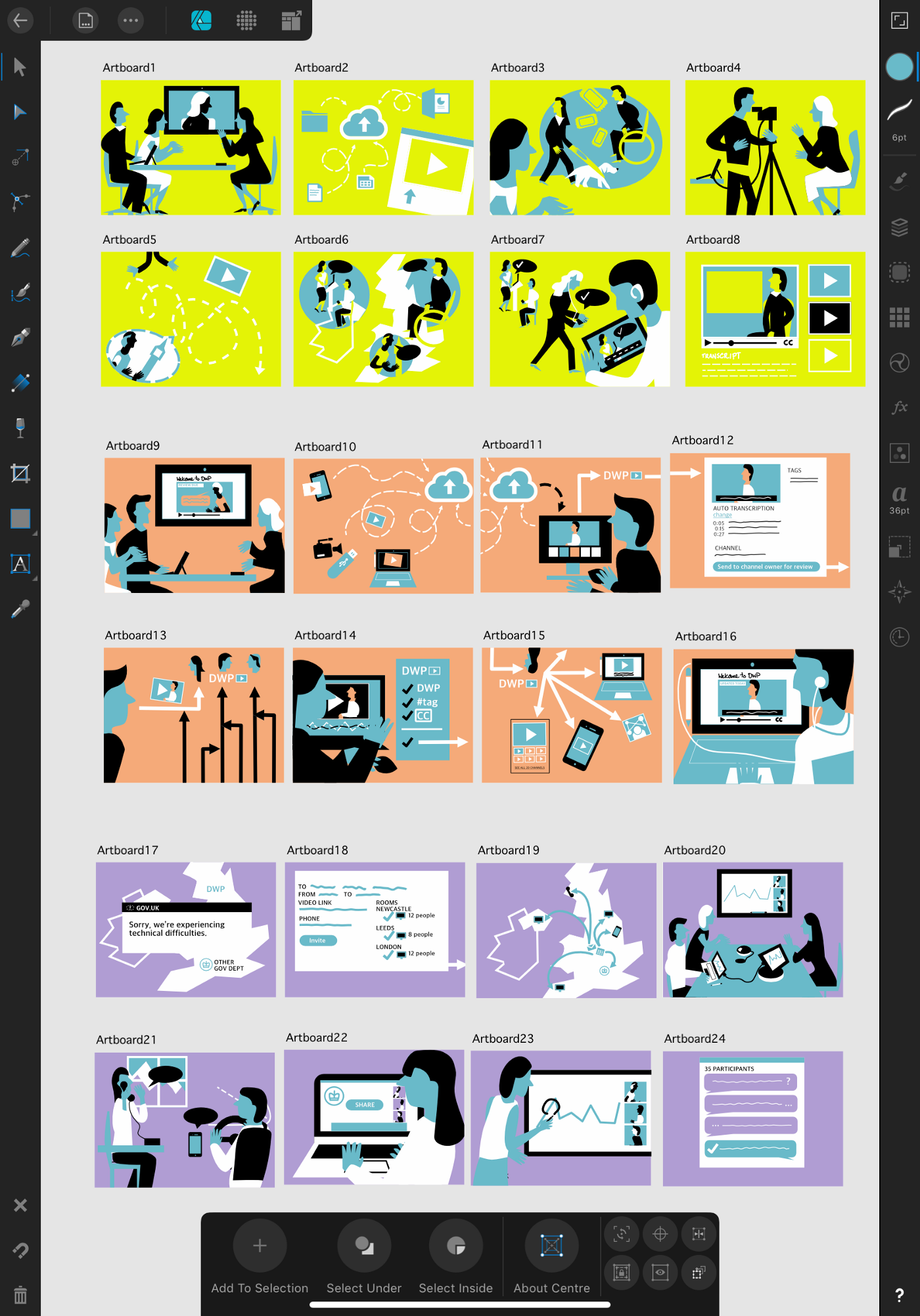
We pitched stories to directorate leaders on what video would look like in DWP. This was so that they could discuss ways that they could use the functionality in their directorates. It was fun to create! By luck, I’d just come back from an illustration course where an illustrator had shown his techniques for quickly creating editorial illustrations, so I was well poised to create a lot of pictures.

Things I learned from this were:
- 90% of the work of storytelling is storyboarding. We did sessions with the relevant product owners to understand what functional and non-functional features they wanted to show. This was important as often it was just as important to show governance and processes as it was proposed features. We initially did this in person but also found that Microsoft Planner (it’s like Trello) also helped us map out the stories and stages. After that, doing the illustrations were easy.
- well-researched, relatable, and everyday stories open up the space for further discussions. As many of the product owners were long-time civil servants, they were able to suggest relevant stories related to the products. We wanted scenarios that enabled conversations, so chose uncontroversial ones: conferences, a technical outage, and an important pre-recorded video. We then fact checked the scenarios with appropriate people so we understood the behind-the-scenes processes. This meant that our stories were sufficiently plausible to not be distracting. It worked well: the directors were able to see what the value was and then overlay their knowledge to come up with their own use cases.
- telling a story about multiple products is like doing a music video for a band – make sure the lead singer doesn’t take all the screen time. I always remember a behind the scenes for the Backstreet Boys’ Backstreet’s Back. When the director was asked what he’d do different, he said: “I should have put in way more Howie”. Juggling different products in a single story is difficult. As mentioned earlier, it was just as important to show governance and supporting products (such as the intranet) as it was to show cool new features.
Performance metrics and UX
I also had the opportunity to give input on both UX metrics and the UX of metrics. The cross-cutting UX performance analyst led this work. It also included input from the Digital Workplace User Experience Testing team.
Things I learned from this were:
- metrics can be a bridge. The performance analyst was in the process of creating unified dashboards. He was using this to start creating unified measures of success. He’s also identified this as an opportunity to identify problems that surfaced in one product but might actually be related to others. He’d also realised that by considering user experience data metrics, the User Experience Testing team could start to gather data that could inform their wider work. This data (and even the process of making the data such as surveys) could also feed into usability testing sessions.
Working on a Microsoft Teams discovery and alpha
I collaborated with a discovery Microsoft Teams team (yes, that’s confusing). I contributed from a design perspective as they investigated if and how to roll it out to the department.
Things I learned from this were:
- the enterprise UX space knows a lot of the challenges for rolling out to colleagues. Microsoft Teams has a lot of support material, including personas (the link to them is on page 6 of the Teams adoption flipbook), and pillars for adoption success (shown below and taken from the Kressmark blog).

- knowing the government service standard helps early conversations. The team had already started conversations with other government departments. They’d advised against doing a tech-led rollout as they did and instead focusing on user journeys and adoption. This ties in well with the service standard alpha and private beta phases. For me, knowing the service standard has meant that I’ve asked early about onboarding and support. I then started conversations with the appropriate teams as to how to prototype this. We’ve also built in testing the alpha service with people with access needs to make sure that people aren’t left behind.
- well-framed design thinking sessions with users are useful for illuminating both detail and difference. We were fortunate that the Digital Workplace UXE team had a design thinking workshop expert from Microsoft. We were able to use his time to facilitate user workshops in Manchester to understand their as-is and to-be scenarios. I’ve been nervous in the past about the tendency for these types of workshops to turn into focus groups. However, by working closely with the facilitator we were able to unpack a lot of details. What’s more, the workshop format let other relevant people from the Digital Workplace to the stories first hand.
- a designer’s role in a consumer-off-the-shelf product is about journeys and prototyping wraparound materials. From interrogating the invite email to setting up a support team based on best practices, to understanding what guidance should go where (in the product, on the intranet, service desk knowledge base and so on), there is a lot of design work, even if there are existing vendor materials (and there a lot to start from!). A prototyping mindset of trying to start with minimal materials and hypotheses and developing these in alpha also encourages a considered approach.
- product rollout for government internal users has to acknowledge organisational memory. There are a lot of stories of past mistakes – people not being able to use kit with their team because one person can’t use their accessibility software on it, products being delivered far later than promised, training that people don’t do because it gets in the way of the job. Add to this the fear of being audited, losing data, or someone actually not being that good with computers, and there’s a very real chance that a new product is seen as traumatic rather than helpful. This was one of the most powerful things we were able to get from the workshops. By asking, ‘what could stop this product being a success here’ we captured a lot of these concerns.
General thoughts
Some of the things I learned from this experience were:
- there are always materials to make prototypes. Even with a locked-down Surface Pro, I made prototypes using intranet forms, excel spreadsheets, and Word documents. The prototyping mindset – make a thing, test, and learn – doesn’t need design kit to do it. One of the biggest wins I think we had as a team was demonstrating that these types of experiments were possible.
- the difference between a service designer and an interaction designer is not just the level of focus, but the means of making. I’ve toyed with the idea in the past of switching from interaction design to service design. However, service designers make primarily through coordinating and talking – co-design, education, facilitation. While they do make visual artefacts such as maps, these are generally secondary. Interaction designers are the opposite. They primarily make individually or with a small team – sketches, prototypes, flows. As much as I can do service design, I love the meditative state of coding and drawing alone
- any sufficiently large government organisation resembles a company after several acquisitions. The last place I worked at was a digital agency that was acquired by Capita. The systems (Slack, Google Suite and so on) immediately became ‘shadow IT’ in the Capita world of Microsoft. If we were using the Capita VPN we couldn’t access our Google email or Slack! After doing some research into DWP on Wikipedia, I now understand that the department has we see today is a combination of merged delivery agencies brought together. (Disclaimer: I was going to map out the history for this article but it’s sufficiently complicated that it’s a task in itself!) Its digital division was also previously contracted out so able to have far more relaxed software restrictions. These separate worlds aren’t easy to bridge but finding ways to do so are key . (Jared Spool’s talk to DWP interaction designers on Security UX has a lot of good principles about this, namely in relation to security perimeters). This will also be the first step to better knowledge sharing with other departments.
- there is absolutely a place for service design around consumer-off-the-shelf-products. It’s great that the C&CS team has recognised the value of cross-cutting UX. There are many opportunities to use service design tools such as service mapping, experience prototyping and envisioning to create considered experiences across the different product ecosystems, both within the C&CS but also back up to the wider Digital Workplace.
What I’ll take back to working on a citizen-facing service
The things I’m going to take with me going back to working on citizen-facing services is:
Prototype support processes and materials
This could be intranet materials, service desk articles, video courses or digital champions. We’re asked in the service standard to test the support model. Now that I know more about how the processes work, there’s an opportunity to improve these too. I’ll look to engage with the appropriate teams from late discovery. And based on the C&CS front-door process, I’ll investigate if there are ways to to prototype processes before turning them into artifacts.
Investigate opportunities to change internal processes alongside changing digital services
A new digital service could be a lever to review knowledge management processes.
A new service might be a time to:
- move internal files out of shared folders and into SharePoint
- review service desk guidance
- push for intranet guidance to be on the service desk or even GOV.UK.
It might not always be appropriate. But it’s worth a look, especially if colleagues aren’t aware of new products. In particular, I’d look at design thinking workshops with appropriate users to understand these processes.
More understanding of the challenges for colleagues who aren’t issued MacBooks as part of their job
I didn’t get much of a chance to see these people in the previous department I worked for. This has given me a better understanding of the challenges they face.
Member discussion